We’re sure you’ve heard from some proposal experts that it is best to put a picture or graphic on every page of a proposal. Some companies have even gotten into the habit of putting a random photo or graphic on every page to fill space. But pushing to include “more” graphics may actually make your company less likely to win the award – because sometimes more is not better, it’s just more.
 |
If there is not enough compelling text, just throwing a couple of graphics in may be your undoing. The point is to keep reviewers interested in reading your whole proposal. Reviewers will look at a graphic on a page first, and that graphic should be strong enough to make them want to get an even deeper understanding of your proposal by reading the text.
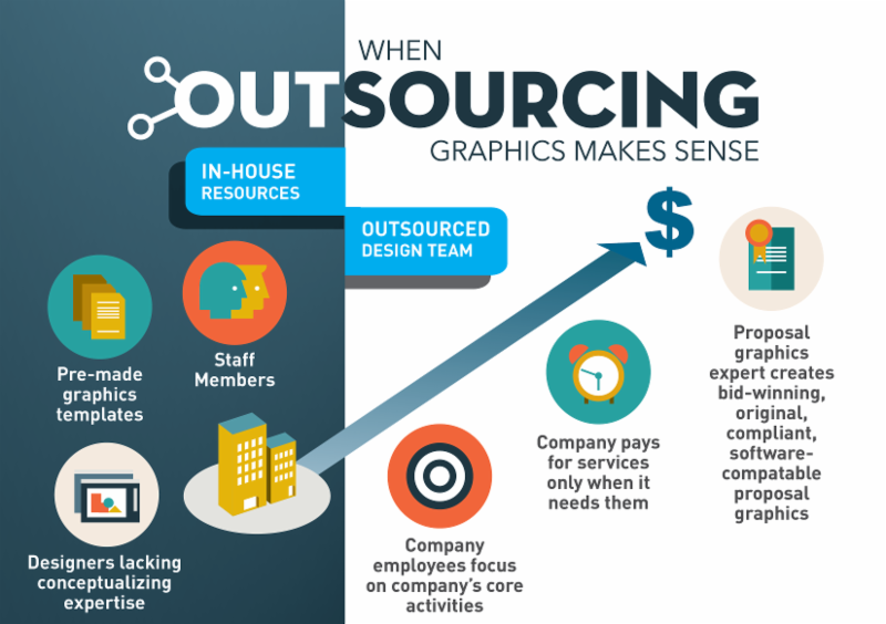
Some graphics are designed to replace blocks or pages of text, and they are essential (an org. chart or a project timeline for example). But graphics have to support and supplement the text of your proposal. It’s about the quality of graphics, not the quantity. The aim is to put out highly customized proposals with targeted messages and unique, proving graphics that support those messages.
Here’s a tip: On pages where a graphic won’t better explain the text, use things like pull-quotes and call-out boxes to break up the dreaded “wall of text” in a proposal. Well-designed text boxes compliment your content and break up boring text blocks while serving to further convey your message.
Need a little help?
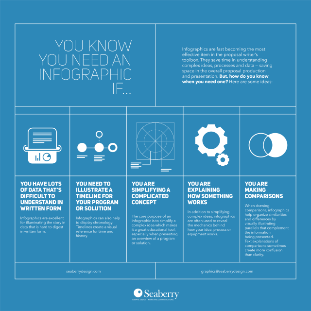
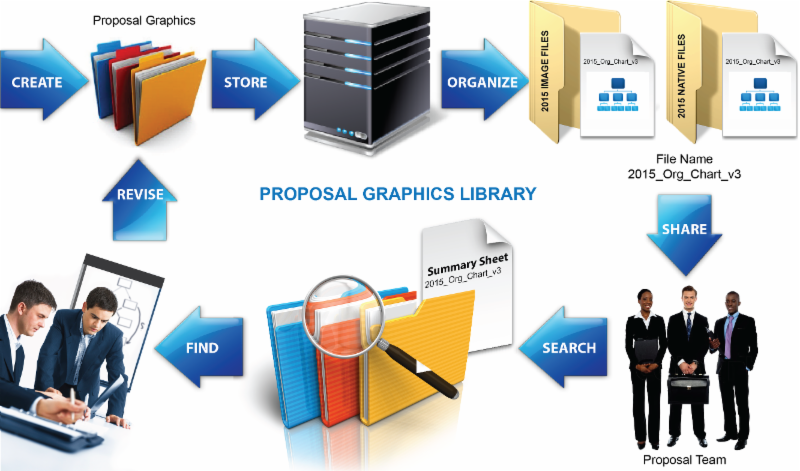
Download the Seaberry Design Graphics Cheat Sheet to get a sense of how graphics work to display data and processes and check out “The Way to Great Graphics on Deadline“, for tips on organizing graphics from RFP to proposal submission.
Contact Us for graphic support on your next proposal.


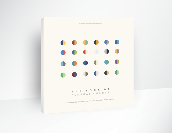
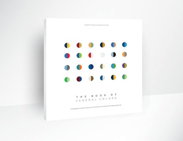 Get your guide to the color palettes of more that 411 federal agencies.